If you’re using the same email templates for every campaign, don’t be surprised if your messages become regular occupants of your subscribers’ bulk mail folders.
Your subscribers get a lot of email, which makes it difficult enough to capture their attention and make them want to engage with your brand. So don’t shoot yourself in the foot by sending carbon copies of the same email every time, regardless of the purpose of the campaign.
Instead, think about the messaging and intent of the email campaign, and choose a template that will best serve these elements. Here are three examples of the most effective email templates with tips on how to execute them.
1. Welcome Email Templates


Why You Need Welcome Email Templates
Welcome email templates are your opportunity to make a great first impression. This is your chance to validate your subscriber’s decision to opt in and show them the value of their participation.
Why We Love These Examples
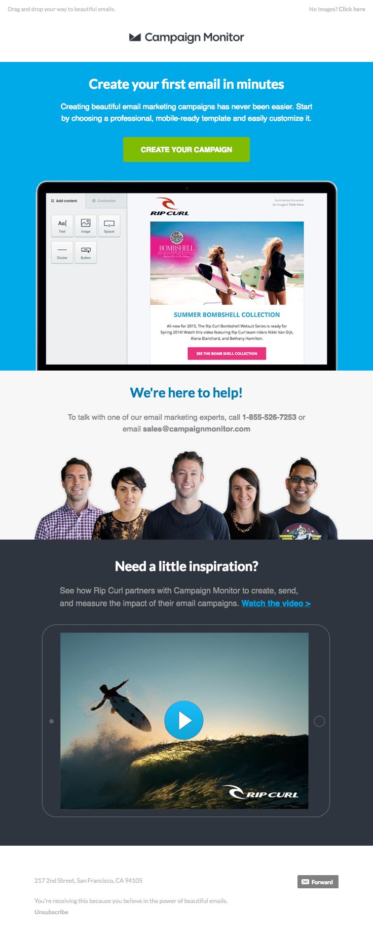
Campaign Monitor‘s welcome email proves its value right off the bat, letting the recipient know they can easily create beautiful and mobile-ready email marketing campaigns in minutes. The call-to-action (CTA) is front and center and stands out from the background. Campaign Monitor also uses photos of actual employees to invite the subscriber to get in touch if they need help and a case study from one of their actual customers to show what the brand can do for the subscriber.
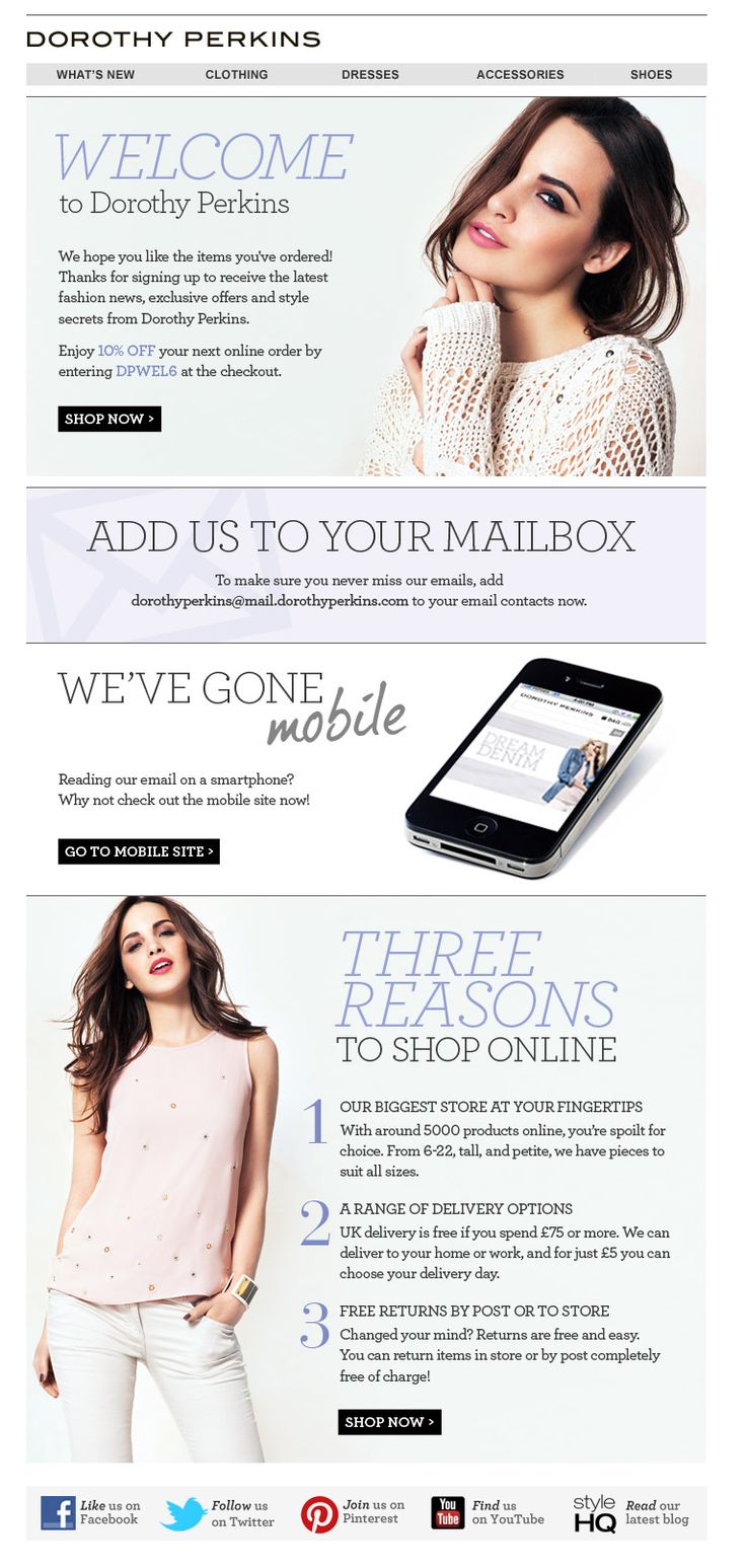
The welcome email from fashion retailer Dorothy Perkins shares many of the same features as Campaign Monitor’s. It has a prominent CTA at the top of the email (directly beneath a discount code for new customers) and has a list of the benefits the retailer can offer customers. Where the marketers at Dorothy Perkins go further is by including a note reminding the recipient to add the sender’s address to their address book. Clearly, Dorothy Perkins knows the importance of email deliverability.
Expert Tips for Welcome Email Templates
- Showcase the value of your products or services
- Include powerful CTAs that inspire subscribers to continue interacting with your brand
- Try to keep content light to avoid overwhelming them on the first touchpoint
- If your company is B2C, create a special offer for new subscribers and lead with it
2. Re-Engagement Email Templates


Why You Need Re-Engagement Email Templates
Not all customers who wander are lost. Re-engagement email campaigns bring valuable prospects back into play by reminding them your brand still cares and providing them with a good reason (for example, a special offer or promo code) to come back.
Why We Love These Examples
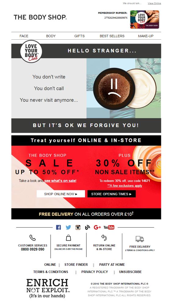
The Body Shop‘s re-engagement email pulls the subscriber in immediately by playing to his or her emotions with a picture of sad makeup and the copy, “You don’t write. You don’t call. You never visit anymore…” What’s great about this re-engagement email is that it appeals to both online shoppers and in-store customers by including two CTAs: Shop Online Now and Store Opening Times. The Body Shop also incentivizes the inactive subscriber with three different offers, including a half-off sale, discount code and free delivery.
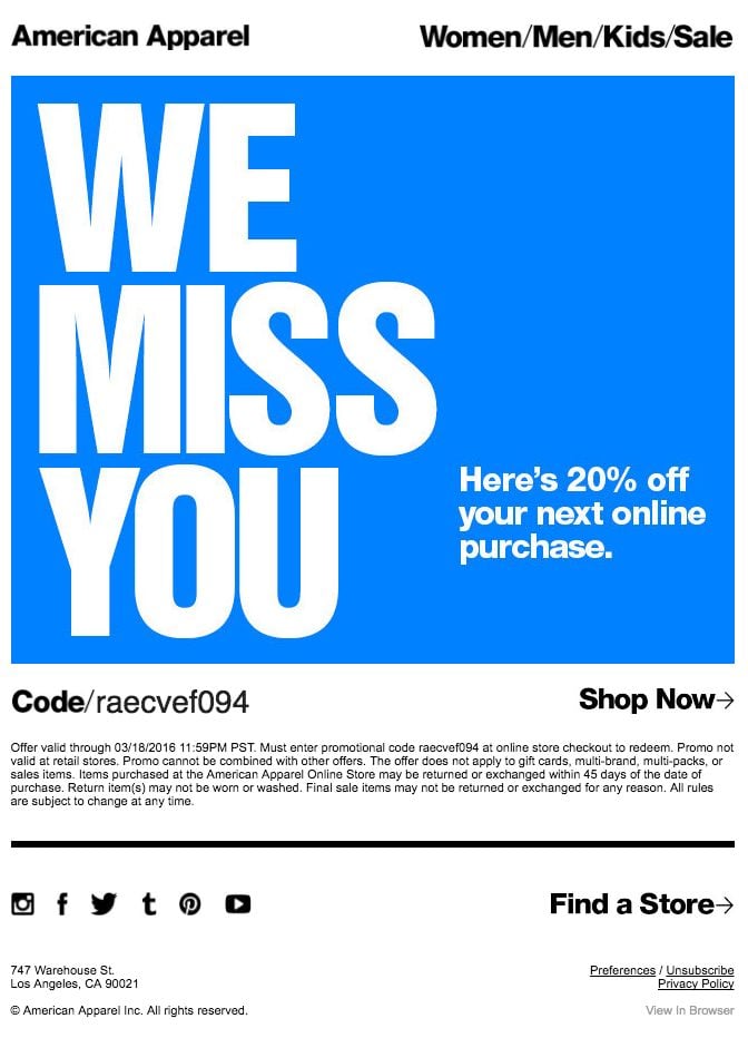
This re-engagement email from American Apparel takes a different approach and gets straight to the point. Fast. The colors are bold, the copy is limited and the recipient knows right away what the retailer is offering: 20 percent off the subscriber’s purchase. Like the Body Shop email, American Apparel’s messaging speaks to those customers who prefer shopping online as well as those who like visiting the brand’s brick-and-mortar stores with a Shop Now CTA and a Find a Store CTA.
Expert Tips for Re-Engagement Email Templates
- Use the kind of messaging that best resonates with your audience – entertaining and tongue-in-cheek or direct and to the point
- Give subscribers a special offer (or two)
- Include multiple CTAs when appropriate
- Don’t neglect the members of your email list who prefer to shop in-person by only promoting your online store
3. Sale Event Email Templates


Why You Need Sales Event Templates
A special sales event is a great way to offer exclusive benefits to your email subscribers and show them the value of their enrollment.
Why We Love These Examples
American Eagle‘s event invitation email is an excellent example of capitalizing on FOMO (Fear of Missing Out):
- The banner at the top of the email tells the subscriber the free shipping promotion ends today
- The main headline exclaims, “These sales are … going, going …”
- The last image is promoting another “limited time” offer
While leveraging FOMO is something all marketers should try, it’s especially powerful when it comes to sales event invitation emails. The other aspect of American Eagle’s email we love is the use of season-appropriate imagery. This sale was held in July, smack dab in the middle of the summer, so the bright colors, palm trees and watermelons perfectly complement the messaging.
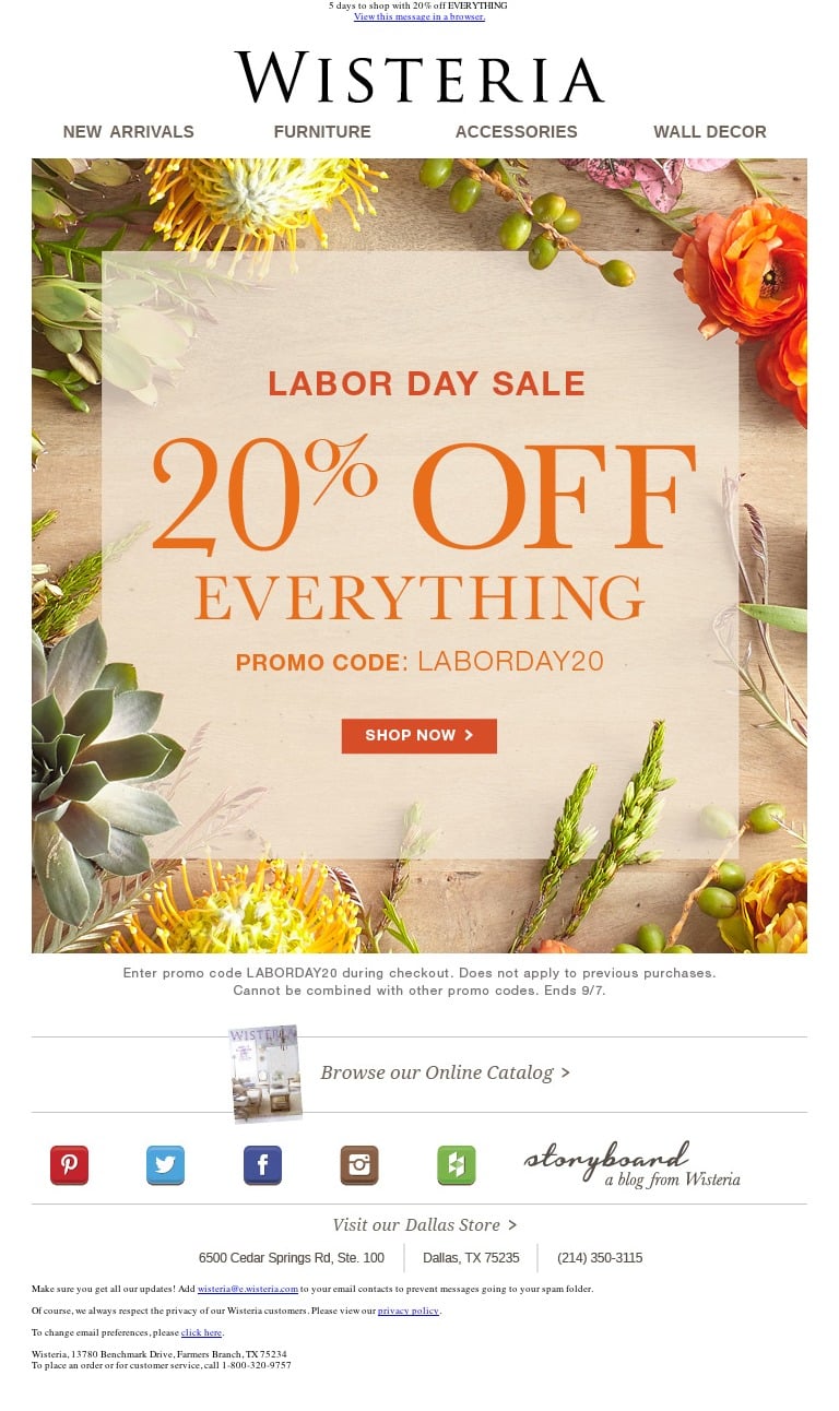
Furniture and decor retailer Wisteria takes the same approach as American Eagle to the imagery in its sales event invitation email. Because the email is promoting a Labor Day sale, the content features fall colors in both the text and graphics. Also, while it’s a bit difficult to see in this screenshot, the preview text for Wisteria’s email says, “5 days to shop with 20% off EVERYTHING,” another example of using FOMO.
Expert Tips for Sales Event Email Templates
- Keep the content focused on the sale
- Highlight what the recipient cares about most – the discounts and special offers
- Put a time cap on the event to create a sense of urgency
- Include imagery that relates to the details of the sale (such as the season in which it’s being held)
The most successful email templates help guide the subscriber’s eye to the most important information. Notice how each of the above examples also perfectly align branding with messaging and appearance, helping to keep the user experience consistent across channels. These companies clearly know who their subscribers are and what they want.
Feel like you don’t know your subscribers as well as these brands know their subscribers? Active Customer Intelligence (ACI) can help. Get to know your potential customers on a deeper level. Learn more about ACI now!
{{cta(‘516faae3-f341-4a08-ab81-685e2df2bc43’)}}


 Affiliate Marketing
 Automotive
 eCommerce and Retail
 FinTech
 LeadGen
 Nonprofit and Political
 Payments
 Technology Platforms
 Tourism and Hospitality
