Spring has finally sprung and so has the new Rapleaf Dashboard. We’ve added a ton of features to help you receive, track, and visualize the Rapleaf data you want. Now when you log in to the Dashboard, you can access all the info you need on both your Batch Append files and API keys.
The Batch Append Dashboard
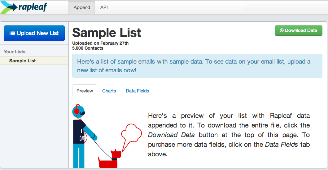
Our new Batch Append Dashboard takes you through the entire Rapleaf append process, from email upload to data download.

Walkthrough Tutorial
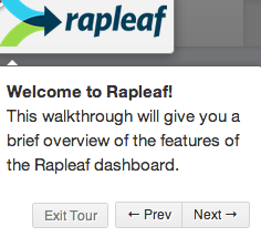
From the start, a pop-up tutorial guides new users through all the steps of uploading a file to the Rapleaf site.
Charts & Graphs
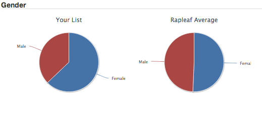
Once you purchase data, the Batch Append Dashboard is also home to aggregate charts and graphs driven by your Rapleaf data. Along with these data visualizations, we also include comparative graphs based on Rapleaf database averages. This way you can see how your emails stack up.
Free Sample List
And, if you’re not ready to upload just yet, you can explore the Dashboard’s features with a free sample file. This sample file gives you a chance to see the type of data reports and charts you would receive as a full Rapleaf user.
The API Dashboard
With the new Rapleaf API Dashboard, you can track your API account at any time.
Real-Time Usage Charts
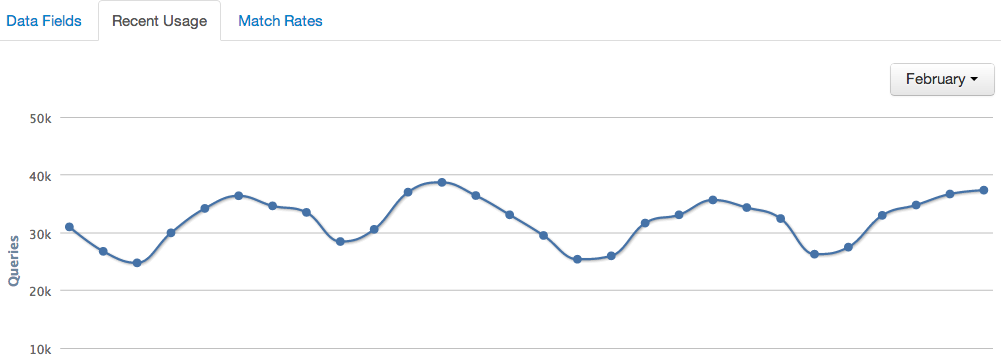
Monitor your recent API usage with a graph of monthly queries that updates in real time. You can track your usage numbers over the last four months.
Real-Time Match Reports
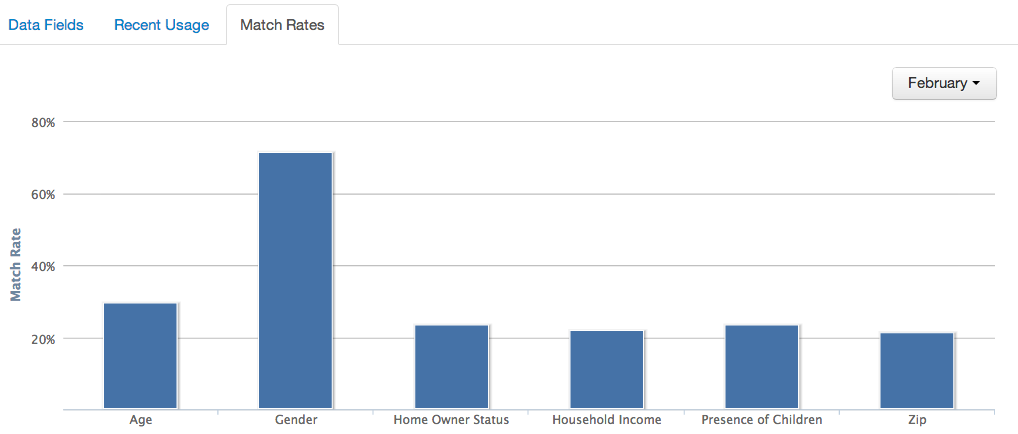
After you take a look at your query totals, check out how much data you’re getting back with a table of match rates generated in real time for your API account.
All and all, the new Rapleaf Dashboard is here to get you the data you need minus the hassle you don’t.

Want to try our new Dashboard out for yourself? Click here to create a free Rapleaf account and get started.
Already taken the new Dashboard for a spin? We’d love to hear your feedback on our recent changes and improvements. Click here for a short and simple user feedback survey.


 Affiliate Marketing
 Automotive
 eCommerce and Retail
 FinTech
 LeadGen
 Nonprofit and Political
 Payments
 Technology Platforms
 Tourism and Hospitality
