The travel industry faces unique challenges in the world of eCommerce. Skift, the travel industries’ intelligence platform, mentioned two important thoughts in their report: “e-mail marketers are steering the industry’s course toward more reliable conversions” and “the time for marketers to fully implement e-mail targeting and personalization strategies is now”.
Face it: selling travel arrangements is never going to be as simple as selling someone a pair of comfy socks. In travel, you’re dealing with larger purchases, which require careful consideration and planning by the consumer, including locations, dates, weather, events, amenities, and everything else that goes into planning their trip.
Personalization and timing drive conversions. This blog post covers elements of design, email content strategy, examples, and DOs and DONTs that help you to push your prospects towards making the purchase with you, instead of a competitor.
The Travel Email Retargeting Funnel
- Abandoned Search
- Abandoned Browse (Destination, Location, Accommodation)
- Abandoned Cart / Checkout
Creating Retargeting Emails for Travel
Travelers want to know that they are getting the best deal possible, but most also want to know that they aren’t trading too much quality for this better rate.
These general desires are important to keep in mind, but what’s more important for creating abandoned search emails, is the data that site visitors generate when doing their travel research.
Effectively marketing to a retargeted site visitor requires that you understand the data that you have at your disposal from their search. Typically, these are the data points you will be working with from a traveler’s search on a site.
Things you will know about prospects:
- The location of the place they wanted to go.
- The prices
- The dates they wanted to travel.
With this information alone, you can drive tremendous value to your prospect by offering them resources to help them plan their trip and find the best price for their flight.
Some ideas include:
- Offering different price flight comparisons.
- Package deals for the location.
- Sample vacation itineraries they might enjoy.
- Event and activity calendar during that time period.
All of this content can be used to your advantage to convert your prospect to a paying customer. Psychologically, you’ll hit all of the cords to build trust, answer their questions, and convince them to make a purchase faster. Couple this with the right level of urgency and incentives, and you’ll be increasing your sales velocity.
That’s how retargeting works for travel, but it’s still helpful to see some examples of how these best practices work in action.
Travel Industry: Example Email for Abandoned Search Campaign
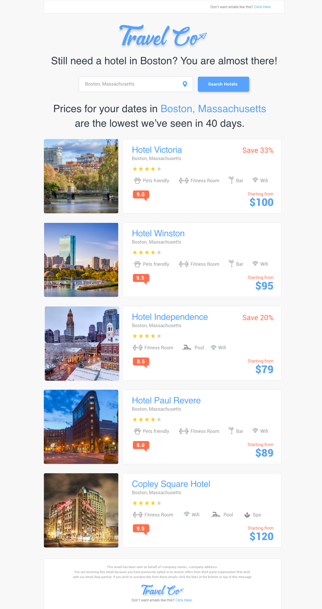
This retargeting email is used near the top of your funnel. Your visitor has searched for a destination and abandoned the site without clicking on a property or offer.

DO’s
- Make unsubscribe easy – Give recipients the chance to unsubscribe at the top and bottom of your email.
- Focus on Conversion – This email is sent to people who left your site after performing a search but before clicking on any properties. They’ll most likely return to a) search again or b) view a property. Put the search box right at the top and follow up with properties they might be interested in, personalized based on their last search. That’s all your email should include. See “DON’Ts” below for things to exclude.
- Incentives – show savings, discounts, and limited-time offers to create urgency and encourage purchase.
- Personalization – Dynamic content is key. The properties you show should be directly relevant to the properties and location that the recipient is interested in.
- Large Pictures – Images attract the eye more than text. Use images to remind the recipient of what they’re missing out on.
- Amenities – Show icons that list the amenities. You can choose to label the icons with text as alt-text or visually display it next to the icon.
- Customer Review Icons – Real consumer ratings carry weight. Show how other people rated the property.
- “Starting from” $ – Your prices change frequently, and are based on dates and other factors. Use the “starting from” date to cover your bases and show a low price. All properties should be within the on-site price range set by the visitor.
- Star ratings – Personalize the list of properties you show, based on on-site behavior.
- Footer, disclaimer, and unsubscribe – follow CanSpam’s rules and give your recipient the chance to unsubscribe.
- Legibility – Choose your font so that it can easily be skimmed.
- Balanced White Space – Ensure that the readers eyes are drawn to the right places, and not distracted by too much busy-ness.
- Product Recommendations – In this Abandoned Search email, your list of properties can be built based on the search done on-site. Since the visitor hasn’t clicked through to any property yet, more detailed product recommendations might be difficult. Save those for the Abandoned Product email (recall: this is the Abandoned Search email).
- Use tracking links – Track the effectiveness of your campaign at driving traffic back to your site
- Use an open pixel – Track the effectiveness of your subject line at driving opens. Opening is half the battle.
- Make emails responsive – You know the stats on mobile usage, right?
- Use single column design – It’s easier to scroll down than scan left to right
- Use a dynamic table– this lets you include as many or as few properties as are relevant to your recipient. That said, you’ll likely limit yourself to 5-10 properties.
DON’Ts
- Distract your audience (social icons) – We see this all the time. Your goal is to bring the visitor back to your site. It’s not to get them to follow you on Twitter, Facebook, or Gazorpazorp. Don’t include links to anything other than your search or your properties.
- Distract your audience(newsletter / blog info) – Yes. We are making the same point, with a different distraction.
- Distract your audience (with background images).
- Distract your audience(with top banners, large images or promotions for anything other than a personalized property / experience).
- Distract your audience(with special fonts).
Why this email works:
It’s simple. It’s personalized. It focuses on the right CTAs for this stage of the buying cycle.
Travel Industry: Example Email for Abandoned Product Browse (Destination) Campaign
This retargeting email is used mid-funnel. Your visitor has searched for a destination, clicked on one or more offers and abandoned the site before going to the checkout. It is VERY common to use a Search Campaign email template, further personalized by showing the destinations clicked on site, at the top of the email to remind visitors of the places they looked at.
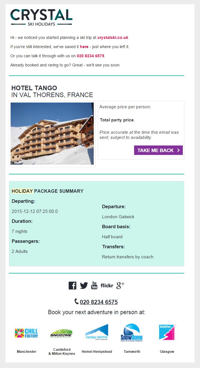
This email template approaches conversion from a different angle: hyper-focus on one property. Whether you choose the property based on the amount of time spent on a page, or the last property viewed, the email content itself focuses on one property rather than multiple.

Why this email works:
This email works because it offers helpful information to the site visitor and has a fun yet direct tone instead of being overly “salesy.”
The first line clearly states the reason for receiving this email, and follows with a low-pressure CTA and a link to book the ski trip they are considering. This is followed by a second CTA offering to help them figure out the details of their ski trip by calling in to “Talk it through with us.”
This email also takes a more creative approach to the standard “please disregard this email if you have already made a booking” disclaimer: “Already booked and rarin’ to go? Great- we’ll see you soon.”
Following this helpful, friendly text, this email reminds the site visitor of their desire to ski with a picture of the lodge they were considering and helps remove their trepidation with “average price per person” and “total party price” information. The CTA on their return to site button “TAKE ME BACK” is also consistent with their fun, friendly tone.
Last but not least, this email provides the site visitor with the details of the ski trip they were planning and another phone number CTA for people who want help planning a trip.
Travel Industry: Example Email for Abandoned Cart or Checkout Campaign
This retargeting email is used at the bottom of the funnel. Your visitor has searched for a destination, clicked on one or more offers, and gone to the checkout — but has not completed their order.

Why this email works:
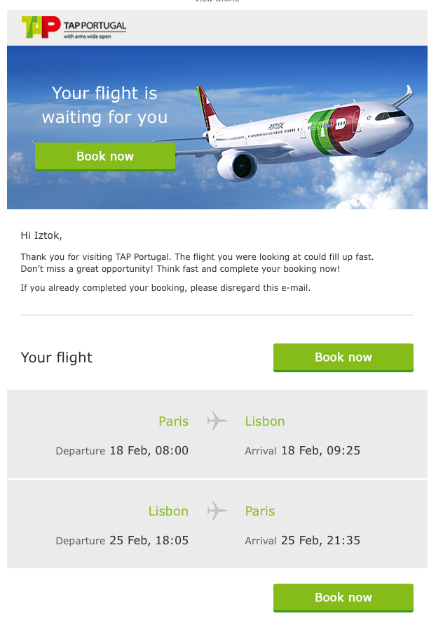
This email is focused on achieving one goal: Book now. The CTA is used in multiple locations on the page: in the header, above the content, and after the content.
The body of the email is personalized, direct and creates urgency by telling the recipient that the flight might fill up soon. This is especially effective, because this flight could be connecting the site visitor with an important family, work or personal event, and this email uses the urgency associated with travel to great effect.
Personalized. CTA-focused. Creates urgency.
Next Steps
-
- Choose the campaigns you’d like to launch
- Decide on the # of emails and timing of those emails in your series
- Target the visitors who abandon your site without leaving an email address, using an email retargeting solution like TowerData.
{{cta(‘aab53d8f-b1f9-4beb-8df0-517a7c50cd5f’,’justifycenter’)}}
Talk with the Email Experts


 Affiliate Marketing
 Automotive
 eCommerce and Retail
 FinTech
 LeadGen
 Nonprofit and Political
 Payments
 Technology Platforms
 Tourism and Hospitality

