 We’ve all been there once or twelve times. You start an online shopping session, only to become interrupted by an email or distracted by Facebook. Or, maybe you added a big ticket item to your cart, but decided you needed to do a little more research before finalizing your purchase. Whatever the case, shopping cart abandonment is a common concern for B2C businesses. On the flip side, though, it represents a perfect opportunity to re-engage already-interested prospects.
Last month, we shared secrets of irresistible shopping cart campaigns. Today, we’re going to take a look at what successful shopping cart abandonment campaigns look like in action.
1. Nordstrom

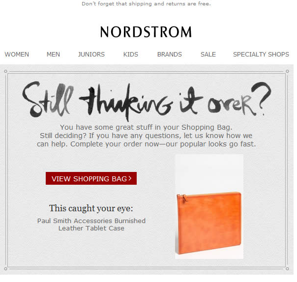
Let’s say you’re shopping for something specific – like a stylish case for your new tablet. You find the perfect burnished leather case and add it to your cart. Then you stop. “Maybe I should see what else is out there,” you say to yourself. Amidst comparing other cases, you receive this email from Nordstrom. There, in all its beautiful glory, is a photo of the original tablet case.
Not only does Nordstrom understand your need to think it over, it’s offering you an opportunity to chat with a sales rep so you can have your questions answered. Or, if you’re ready to pull the trigger, you can easily click-through to your shopping bag. This email offers a little empathy towards taking time to think, which can help win over indecisive buyers. Bravo, Nordstrom!
2. Kate Spade Saturday

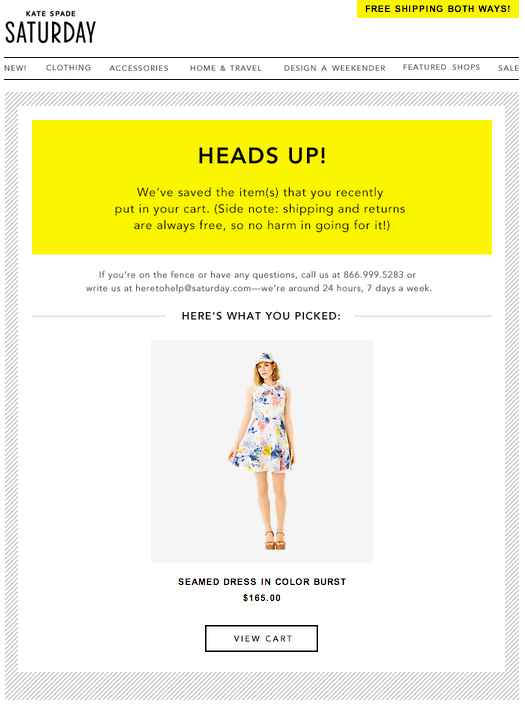
One of the most difficult aspects of online shopping is the looming threat of buyer’s remorse. What if it doesn’t fit? What if you change your mind? This email from Kate Spade Saturday assuages these fears with a friendly reminder: shipping and returns are free “so there’s no harm in going for it!”
The email also includes a photo of the item, an easy click-through to your cart so you can quickly pick up where you left off. It’s simple, it’s colorful, it’s mobile-friendly and it offers a gentle push without making buyers feel pressured.
3. Levi’s

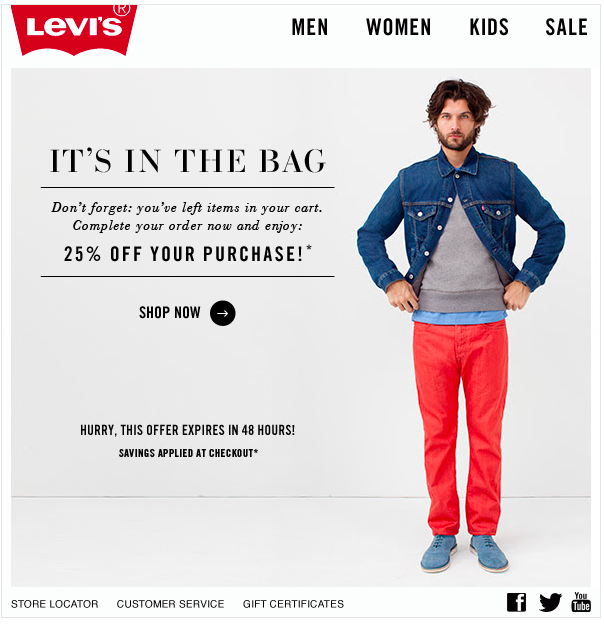
This offer includes the holy trinity of shopping cart abandonment: it’s timely (it reaches your inbox within 24 hours), it includes an irresistible offer of 25% off your next purchase and it’s aesthetically appealing. But, Levi’s has included a bonus tactic: a reminder that the 25% off offer expires within 48 hours. This little nudge uses loss aversion to encourage shoppers to act fast.
Not only will subscribers be eager to return and finish their transaction, but they know they need to act quickly to enjoy the new benefit.
4. Best Buy

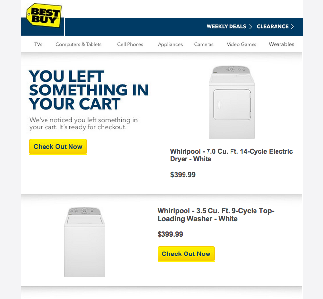
Best Buy knows big ticket purchases require a little more thought. When you’re looking to invest in new appliances, you need to know you’re getting the best deal. That’s why, in this shopping cart reminder, the company adds a reminder of its price match guarantee. Even if you haven’t taken the time to look elsewhere, knowing Best Buy is confident in its pricing may be all a consumer needs to complete the purchase.
Also, like Kate Spade and Nordstrom, Best Buy includes photos of the items in your cart and an easy “Check Out Now” button.
Even when you’ve engaged and delighted your prospects, there’s always a chance they may become distracted before they click “complete purchase.” But, with a well-planned strategy and an enticing cart abandonment email, you can begin earning back your customers interest and re-engaging lost sales fast.
An engaging and irresistible email marketing strategy starts with data. Get all the data you need to attract new prospects and re-engage shoppers with Email Intelligence!


 Affiliate Marketing
 Automotive
 eCommerce and Retail
 FinTech
 LeadGen
 Nonprofit and Political
 Payments
 Technology Platforms
 Tourism and Hospitality
 We’ve all been there once or twelve times. You start an online shopping session, only to become interrupted by an email or distracted by Facebook. Or, maybe you added a big ticket item to your cart, but decided you needed to do a little more research before finalizing your purchase. Whatever the case, shopping cart abandonment is a common concern for B2C businesses. On the flip side, though, it represents a perfect opportunity to re-engage already-interested prospects.