 It’s time to leave behind flat, static emails. After all, if your current and potential customers wanted to consume motionless, non-shareable content, they’d just read a newspaper or a magazine.
Reading your emails should be a dynamic, lively experience for your audience. Your website is interactive, right? So shouldn’t your emails be interactive, too?
Here are six interactive email ideas every marketer (both novices and veterans) can use. If you need more digital marketing help you can always checkout this blog.
Ideas for Rookies
GIFs
An animated GIF is a simple way to breathe a little life into your messages. GIFs are great for making the most of the limited real estate in an email and promoting products in a way that’s more engaging than just a fixed photo. Plus, adding a GIF to your emails is a relatively easy process.
Animated GIFs offer marketers two benefits in particular:
- The ability to display several items in the same space (which leaves room elsewhere in the email for other content)
- An opportunity to illustrate multiple features of a recommended product (which makes it easier to prove to the consumer they should buy the item)
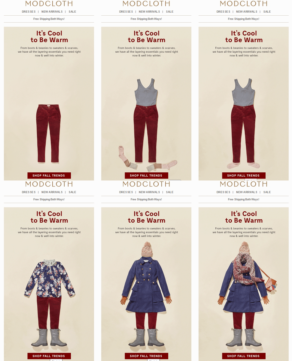
The ModCloth email below is a great example of how to simultaneously cross-promote multiple products in one marketing message:

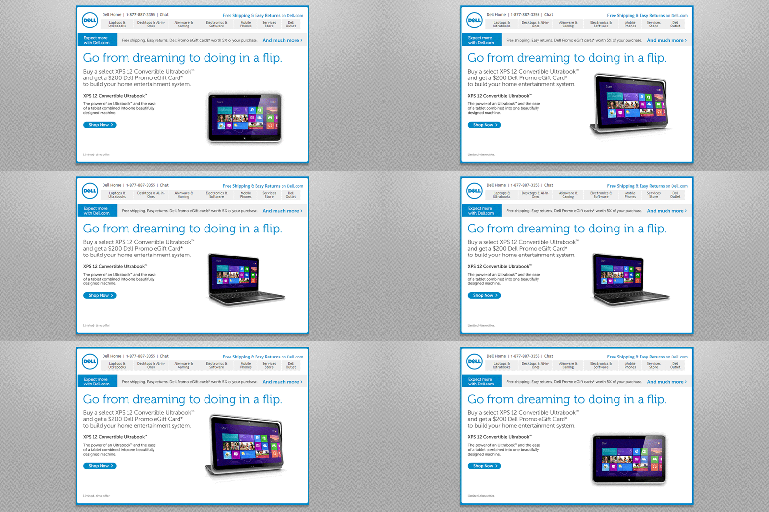
This interactive email from Dell shows consumers how its Ultrabook computer transitions easily from a standard laptop to a tablet and back:

Social Media
Sharing If you have a little more experience with email marketing, you may have the know-how to embed a Facebook or Twitter feed directly into an email. But if you’re a bit newer to the email marketing game, don’t worry-you can still take advantage of your social media accounts in your marketing messages.
There are generally two reasons to include social sharing buttons in your emails:
- You want to invite the subscriber to connect with you on Facebook, Twitter, Instagram or LinkedIn
- You want the subscriber to share your marketing email with their own social network
Giving recipients easy access to connecting with you is pretty simple since any email marketing software will let you place the necessary icons anywhere in your message, like in Trello‘s email below:

But if you’re looking to encourage subscribers to share your email, you can take one of two routes: subtle, as in this first example from Bassett Furniture:

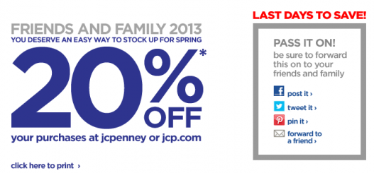
…or not so subtle, like in this email from JCPenney:

Your approach should be based on which option you think your audience would prefer.
Email Sentiment Icons/Widget
Marketers spend hours every day poring over open rates and click-through rates in an attempt to see exactly what kinds of emails their subscribers seem to enjoy most. But here’s another option: Ask the subscribers directly with an email sentiment widget.
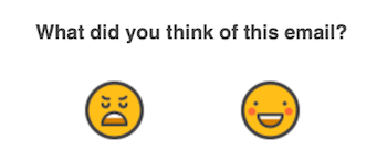
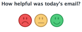
While you can certainly just add a line of text at the bottom of the email that says something along the lines of, “Was this email relevant to you?” with an option to click “Yes” or “No,” a graphic-based email sentiment widget requires no coding or CSS and is more likely to solicit a response.
If you want to keep it simple, you can take a note from one of these first two examples which only offer two and three rating options, respectively.


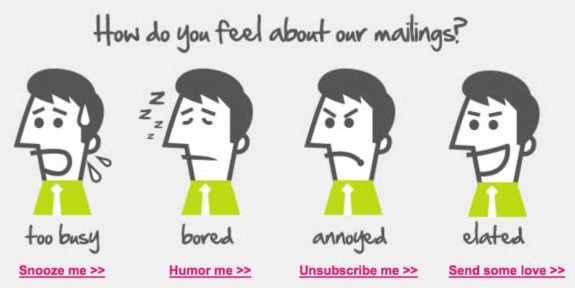
Or if you’d rather get more insight into the subscriber’s opinion beyond “Yes, I like this email” or “No, I do not like email,” you can use this example from Whereoware for inspiration:

Ideas for Pros
Image Carousels
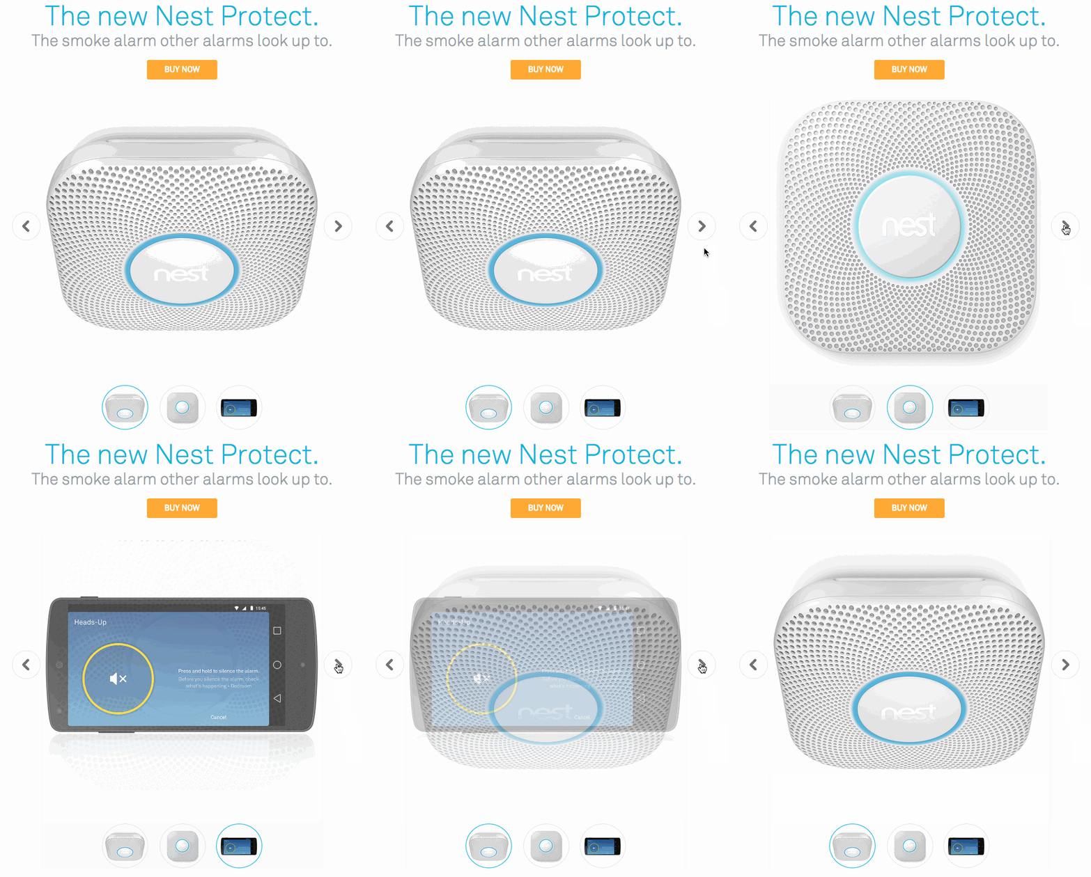
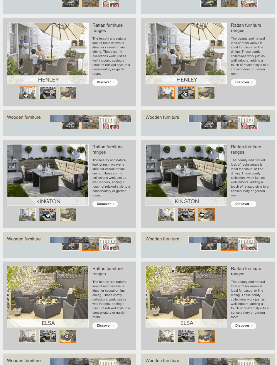
You can think about an image carousels as GIF v2.0. In other words, image carousels serve the same basic purpose (showing multiple images or multiple product features in the same space), but they also give the subscriber to control which specific product or feature to view.
Here’s an example from Nest showing the benefits of its new Nest Protect smoke alarm:

Click here for a live version.
In the example below, B&Q uses an image carousel in its interactive email to let shoppers see various types of outdoor furniture:

Full email can be found here.
Live Shopping Cart
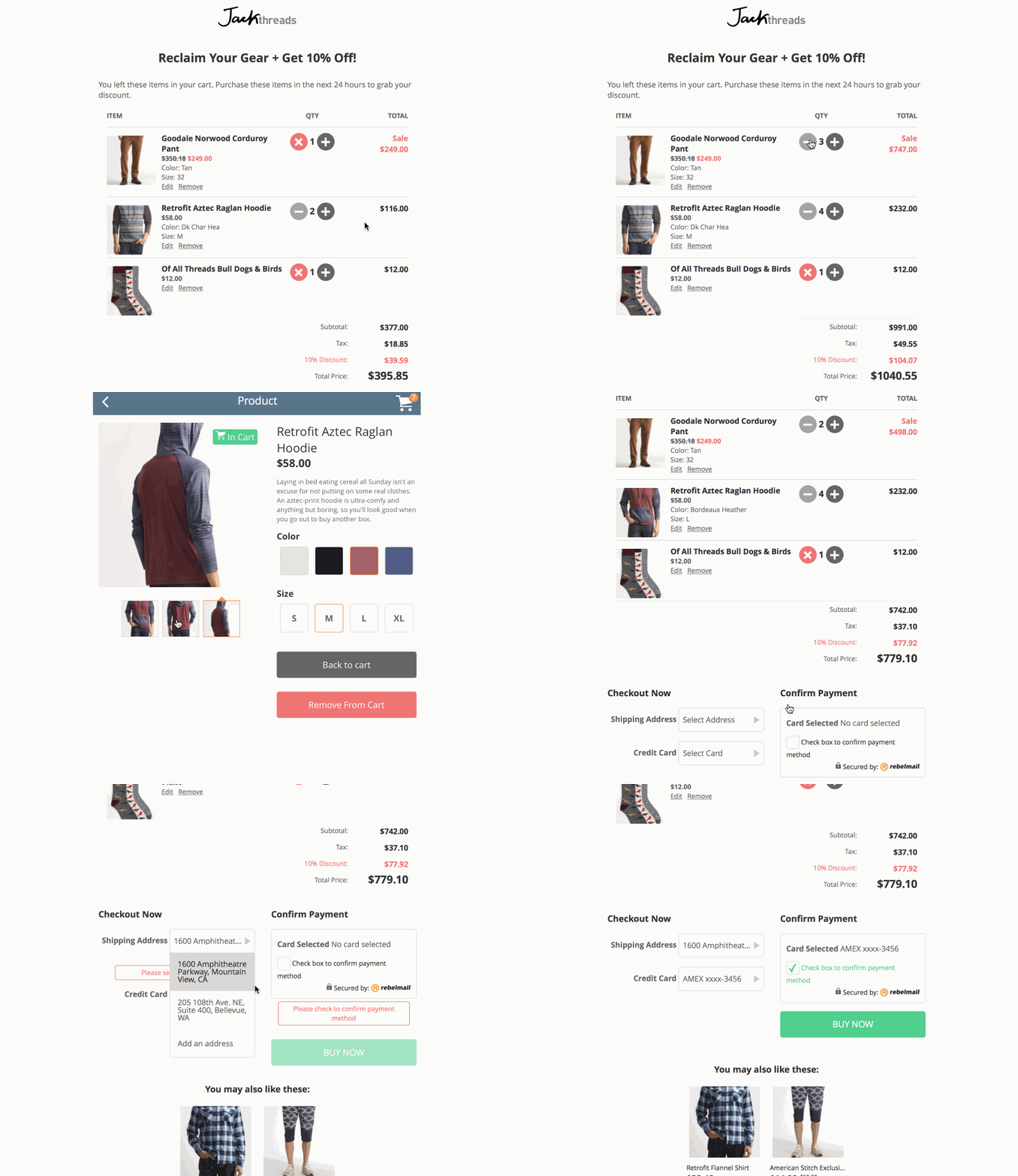
You’re likely already sending Abandoned Cart emails when a customer leaves an item in their shopping cart without placing an order (if you’re not, you need to start now). But what if you gave them the option to make changes to the products in their cart directly from an email?
Coding an email that gives customers the ability to update their shopping cart without visiting the site directly is not for the faint of heart. Mark Robbins of RebelMail designed the example below which, while definitely impressive, requires complex HTML and CSS that allows syncing of image galleries between the site and the email, dynamically updated prices, taxes and discounts as well as form validation. Whew.

There are a few potential roadblocks to including a live shopping cart in an email (which Robbins outlines on his blog) such as file size and rendering issues. But as Robbins points out, the majority of email users are able to see at least some level of interactive content.
Personalized Product Previews
Be it food, clothing or cars, every product line presumably gives consumers the option to personalize items to a certain extent. Most e-commerce websites allow a customer to view previews of their products with his or her specific choices-for example, color, style or unique customizations such as a monogram-prior to purchase.
Similar to the live shopping cart idea, in-email personalized product previews are another technique that encourages engagement without requiring the subscriber to ever leave their inbox.
This tactic also requires a more advanced skillset, but the amount of coding required depends on how many different ways you allow recipients to interact with the email.
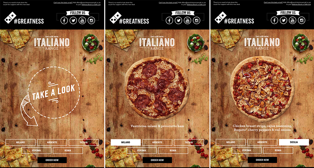
In the example below, Dominos in the U.K. invited its subscribers to see previews of the new Italiano Range pizzas:

Check out a live version of the email here.
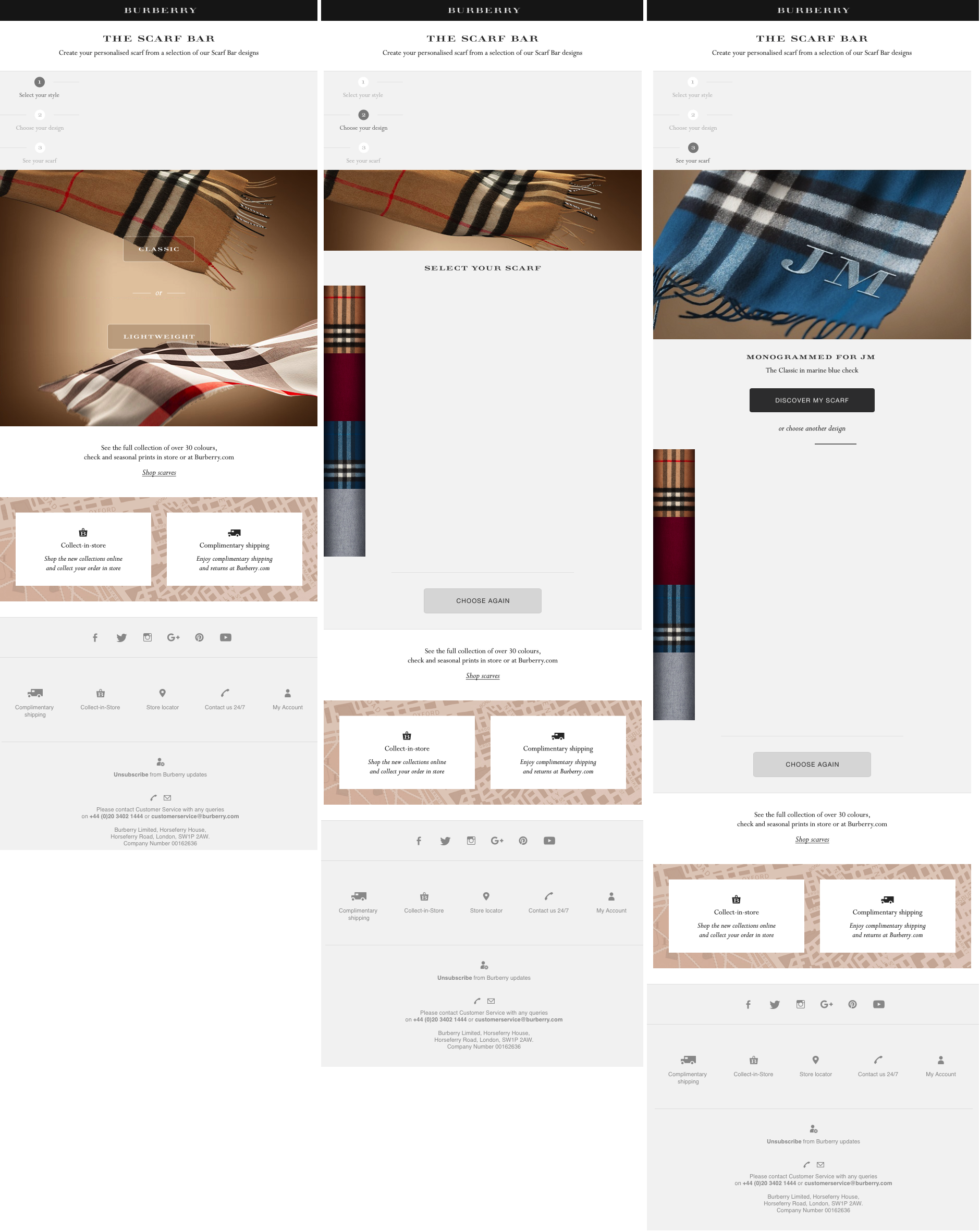
Burberry takes the in-email product personalization a step further with its “Scarf Bar”:

See a live version of this email here.
Not only can shoppers choose the style and pattern, but the preview includes a monogram of their initials, pulled directly from Burberry’s customer database.
As with any email marketing strategy, only use the elements that will best resonate with your audience. Don’t waste time adding interactive email content if you don’t expect it to increase the success of your email marketing. What are some of your favorite examples of interactive content? Let us know on Twitter, Facebook or LinkedIn!
The best way to know how to engage with your customers is through comprehensive insight into their interests. Learn how Active Customer Intelligence can help you get a more detailed picture of your audience.
{{cta(‘516faae3-f341-4a08-ab81-685e2df2bc43′,’justifycenter’)}}


 Affiliate Marketing
 Automotive
 eCommerce and Retail
 FinTech
 LeadGen
 Nonprofit and Political
 Payments
 Technology Platforms
 Tourism and Hospitality
 It’s time to leave behind flat, static emails. After all, if your current and potential customers wanted to consume motionless, non-shareable content, they’d just read a newspaper or a magazine.