Father’s Day occupies a strange place in the email marketing calendar, coming in near the end of an almost nonstop promotional period that begins with Easter, runs through Mother’s Day, Memorial Day and Graduation and wrapping with July Fourth promotions.
Whether by design or by accident, Father’s Day promotions generally pale in comparison to Mother’s Day, one of the biggest consumer holidays on the retail calendar.
Mother’s Day spending dwarfs Father’s Day. The National Retail Federation predicted that Americans would spend $23.6 billion on Mother’s Day this year, compared with $15.5 billion projected spending for Father’s Day.
But $15.5 billion is still a handsome chunk of change to chase, and retailers went after it with a variety of styles. The best executions we found used the gift-guide format, and the best gift guides fitted the merchandise collections to classic “dad” personas – golfing dad, tech dad, traveling dad.
Dads can be hard to buy for if you’re not into the same things he is, and the persona-based gift guides reassure customers that something in the collection would appeal to Dear Old Dad.
Below are seven gift guides for your holiday-inspiration swipe file, plus one we included if you want to go for sentiment over sales for your Father’s Day message.
1.) Most Creative Father’s Day Email
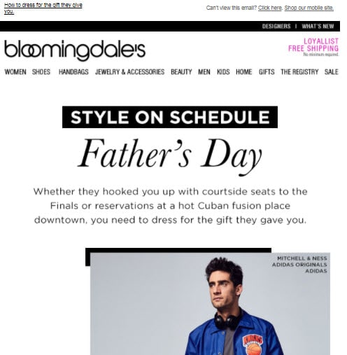
Subject line: Style on Schedule: Father’s Day — Sender: Bloomingdales

Bloomingdales has been making headlines lately for its detailed segmentation that uses both preference and behavioral data to appeal to different slices of its customer database. This email, sent to men shoppers, turns the gift-guide concept on its head by suggesting fashions Dad could wear to match the experience gifts his loved ones gave him.
This is a timely variation on the usual gift-guide concept because the NRF study found that experiences and events, rather than packaged gifts, make up the No. 1 Father’s Day gift category. Also, the fashion collections make up a gift guide of their own, even if it’s not the usual collection of things.
We liked the copy that opens this email, because it strikes the right note of practicality mixed with aspiration:
“Whether they hooked you up with courtside seats to the Finals or reservations at a hot Cuban fusion place downtown, you need to dress for the gift they gave you. Don’t worry, we got all the bases covered.”
Another bonus: the preheader. “How to dress for the gift they give you” sets up the expectations for this email. And there’s nary a tie or pair of goofy socks to be found.
2.) Dad Jokes
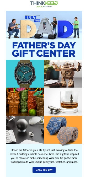
Subject line: Built [ ] for Dad: ThinkGeek’s Father’s Day Gift Center now open! — Sender: ThinkGeek

If you know ThinkGeek, you know you’re going to get a bunch of goofy gift suggestions, and ThinkGeek does not disappoint with this clever assortment. We picked it for the humor (the sender line in the inbox: “ThinkGeek Overlords” <[email protected]> stands out) but also for the subtle animations farther down in the email.
Our one regret: the emoji in the subject line didn’t render. That’s a good reminder to test your subject lines across browsers, clients and devices so everybody gets the joke.
3.) More Dad Jokes
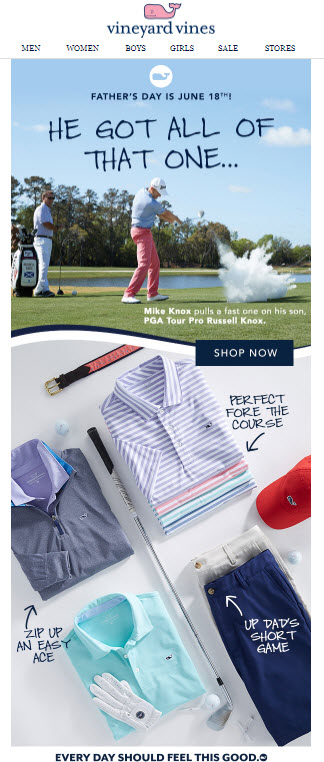
Subject line: Father’s Day is almost here! — Sender: Vineyard Vines

This gift guide has it all, from the practical-joking golfer dad in the hero image to the bad-dad-puns in the gift assortment. Groan and roll your eyes, but the merchandise is on brand for this retailer, and the imagery will resonate with just about anyone who survived a day on the links with their fathers.
4.) My Eight Dads
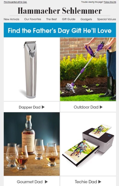
Subject line: Father’s Day Gift Guide — Sender: Hammacher-Schlemmer

This gift guide plays it straight with eight merchandise collections geared to eight personality styles (“dapper,” “techie,” “fun-loving,”). The email shows only one item per category, so customers must go to the website to see the rest of the items.
This creates a more streamlined look but might not serve time-pressed customers who want to see gift ideas in the email without having to click to a site. You have a lot of competition in the inbox; so, anything you can do to reduce friction and speed up decisions in the email could pay off in conversions.
5.) No fat-finger jokes here.
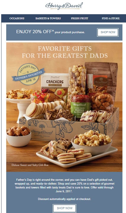
Subject line: Shop our Father’s Day collection of gourmet gifts and save. — Sender: Harry & David

We picked this gift guide for its extreme mobile friendliness. See how each gift collection has its own “Shop Now” button? That makes it easy to click on the right one when you’re peering into your little mobile screen. Fat-finger mistakes are frustrating. Make it easy for your customer to click the right link.
We also liked the preheader: “Discover the perfect gift to surprise Dad and save 20%.” Although we might have rewritten it to put the 20% incentive at the beginning to amplify the subject line, H&D might have testing this and found it works better near the end. Either way, using the preheader to add more info to your subject line gives customers more reasons to open the email and see what you have on offer.
See more preheader ideas at the end of this post.
6.) More mobile goodness
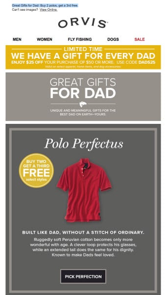
Subject line: We’ve got Father’s Day down to a science. You get $25 off $50. —Sender: Orvis

Two key facts to digest first:
1. More than half of all emails are opened on smartphones and tablets today.
2. Desktops still account for more conversions, but mobile is closing the gap.
Those two realities add up to an imperative that your design work must well on mobile. Responsive design is one option, but it’s not foolproof. Adopting one design that works on mobile and desktop is another, but you can end up with long, skinny emails that demand lots of scrolling no matter which device you use.
Orvis’ design walks the fine line well, with a blocky, stacked format that delivers its payload in just a couple of screens. The copy is easy to read and click on. Somebody took a couple extra minutes to come up with unique copy for each CTA button. And, let’s be honest – we love a little pointy-headed intellectual humor, too.
7.) Content Marketing FTW
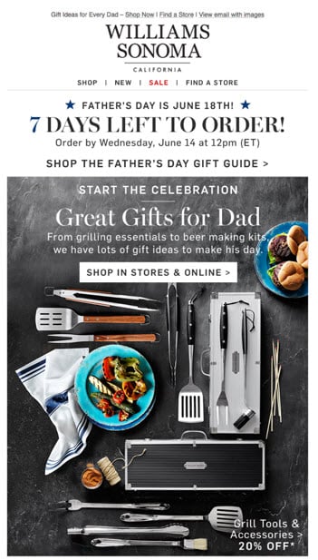
Subject line: Gifts Dad Will LOVE – Father’s Day is June 18th! — Sender: Williams – Sonoma

Lots to love in this Williams-Sonoma email, starting with the bold ordering-deadline reminder at the top of the email. We picked it because it combines buying advice with product promotion.
Also, the products highlighted in the email – bakeware, espresso maker, etc. – can be complex to buy. Having salespeople as virtual assistants in the email (not just at the website) reduce uncertainty and increase buying confidence. Having gifts at various prices also expands options for customers with different levels of buying power
8.) We Love You, Dad
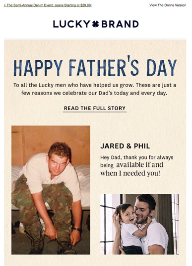
Subject line: Happy Father’s Day from Us to You — Sender: Lucky Brand

Although far more retailers sent greeting-card-style emails on Mother’s Day, with subtle or no promotion outside of standard navigation devices, we did find a few that sent virtual hugs.
Although this Lucky Brand email is not a gift guide, like the other seven in this post, we wanted to include because it mixes family photos and sincere sentiment to let fathers know that, despite the jokes, we do love and appreciate them.
Preheaders to swipe
Even if an email didn’t make it into our Top 8, we found many with elements worth copying. Below is a list of preheaders that added value to the inbox and gave readers more reasons to open, whether they set up expectations for the email, delivered a secondary call to action or added extra information that wouldn’t fit or have been appropriate for the subject line.
- Lillian Vernon: Enjoy $3.99 Shipping & 10% off any order. Use code 05782026.
- StarStruck/Fanatics: Score #1 Dad Tees Before They’re Gone SHOP NOW
- Anya Hindmarch: Create a unique gift this Father’s Day by adding an embossed message or graphic. Having trouble viewing this email? Click here.
- Northern Brewer: Get a $50 Gift Card Free
- Artful.com: Artful gifts for fathers, plus outdoor entertaining, summer jewelry & more!
- Harry & David: Discover the perfect gift to surprise Dad and save 20%.
- Bloomingdales: How to dress for the gift they give you.
- Swiss Colony: We’ve got gifts both delicious and durable to make a very happy Dad!
- Cabela’s: Whatever he likes to do, we’ve got a gift for that
- Orvis: Great Gifts for Dad: Buy 2 polos, get a 3rd free.
Subject lines we liked
As with the preheaders, we found some distinctive subject lines. Even though Father’s Day doesn’t inspire the same inbox flooding that Mother’s Day does, you still need something that stands out when everybody else uses “Father’s Day Gift Guide.”
- Northern Brewer: Thwack. Thwack. You Just Nailed Father’s Day!
- Tommy Bahama: Aloha Father’s Day!
- Century 21: MY DAD, MY HERO: Dress Shirts, Ties, Cologne, Polos, Tech & More Father’s Day Finds
- Mark & Graham: What to get Dad for Father’s Day? We made a list…
- Orvis: We’ve got Father’s Day down to a science. You get $25 off $50.


 Affiliate Marketing
 Automotive
 eCommerce and Retail
 FinTech
 LeadGen
 Nonprofit and Political
 Payments
 Technology Platforms
 Tourism and Hospitality
