 You might not know it, but BuzzFeed had a newsletter problem. The popular website doesn’t just serve up the hottest viral content; it also sends out an engaging email newsletter each week to keep subscribers in the loop. But Buzzfeed’s trademark pictures and lists don’t mean a thing if newsletter readers don’t see them, and many did not because many email clients disable images by default. While BuzzFeed knew going easy on the images would improve its email deliverability, it also didn’t want to water down the unique BuzzFeed style subscribers have come to know and love.
Fortunately, BuzzFeed had a plan: optimize its emails for plain text. With just a few smart tweaks, every BuzzFeed email now boasts the signature BuzzFeed style-whether subscribers read it as plain text or HTML.
Why are Plain Text Emails Important?
Plain text might not offer the rich visual details that HTML does, but it does have a few advantages of its own: deliverability and accessibility.
Deliverability
HTML-only emails are a red flag to spam filters. Spammers know most of us prefer the visual excitement of HTML emails to plain Jane text-only emails. As a result, they don’t usually bother with plain text emails that won’t bring them enough of a return on their investment. So when you send an HTML email by itself, spam filters take notice.
This is also why it’s important plain text and HTML versions be similar. If a spammer creates a plain text version of an HTML email, it’s likely to be only a minimal effort. If you send a plain text version that’s very short-for instance, only including a link to your website-it may also cause your email to get flagged as spam.
Accessibility
Some browsers, email clients and mobile devices can’t handle HTML. Additionally, many email inboxes turn images off by default. In these cases, your graphics might render as a big blank space with a little red “X” in the corner-hardly the look you were aiming for. There’s an excellent infographic by litmus that highlights just how tough the “road to rendering” can be for the average email.
Image rendering isn’t the only compelling reason to send plain text emails. Plain text is a lot easier to create and may be a more efficient format if you send a lot of messages. Plain text emails also look less like “marketing” and more like a personal message, which many subscribers actually prefer. The right solution, as with everything about email marketing, is to test what’s appropriate for each of your audience segments.
Ensure HTML and Plain Text Emails are Delivered
Assuming you’re sending both HTML and plain text versions of your email, what can you do to ensure your emails land in the inbox and get read?
Assign Clear ALT Text to Images
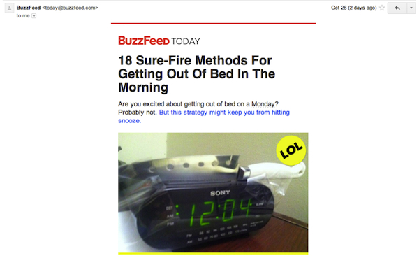
When BuzzFeed realized its images might not render, the company also realized its ALT tags needed improvement. Here’s what a BuzzFeed email looks like with images:

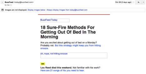
And here’s that same email when the images don’t render:

Still fun, still exciting, still engages the reader. Which leads us to our next point…
Make Sure Your Email Can Stand Alone Without Images
Even without images, the copy in this BuzzFeed email is compelling and encourages the reader to click. Ask yourself (and answer honestly) is your email copy this effective?
Don’t use Light-Colored Text on a Dark Background
If your email has a dark background with white text but the dark background doesn’t render properly, what happens to your white text? It becomes invisible! Never rely on a background color to make your email readable.
Avoid CSS
Not all email clients or browsers accept the same codes. In fact, many email clients strip CSS out or overwrite it. If you must use CSS, keep it to a minimum and only use simple attributes such as fonts or colors.
Don’t Copy and Paste from Word
Special symbols like circular bullet points and formatted text like curved apostrophes can cause display issues in some email clients. It’s often safer to simply retype the original text directly into your email program.
Consider How the Copy Will Look in Plain Text
Headers, for example, won’t be large and bold like they are in HTML. Try using all caps to make the header stand out visually. Also, look for ways to break up big chunks of copy because there won’t be graphic elements to create interest.
Include the Full URL of All Links in Plain Text
Hyperlinks usually aren’t clickable in plain text. Instead, spell out the complete URL so readers can cut and paste it directly into their browsers.
Ultimately, deciding when to use plain text and when to use HTML will depend on your audience. Try out A/B split testing to see how the two formats perform for your subscriber base, and tweak your strategies from there.
Want more email marketing help? Subscribe to the TowerData blog today!
Photo Credit: Jesper Rønn-Jensen


 Affiliate Marketing
 Automotive
 eCommerce and Retail
 FinTech
 LeadGen
 Nonprofit and Political
 Payments
 Technology Platforms
 Tourism and Hospitality
 You might not know it, but