 Heart-shaped boxes of chocolate, a dozen roses and a bottle of champagne. Sure, those things are nice, but the real way to the heart is through a great email.
OK, maybe that’s just us.
While a great email may not lead you to the love of your life (although it did simplify the process for Meg Ryan and Tom Hanks), it can win the affections and loyalty of your customers. A well-crafted, well-designed and properly targeted email inspires brand recognition, a better subscriber experience and all sorts of warm fuzzies. In honor of Valentine’s Day, here are three emails that have us falling head over heels.

Charity: Water
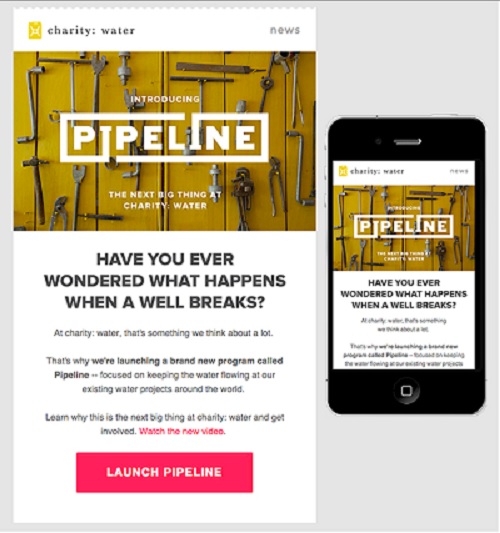
This New York City based non-profit organization won us over with this announcement message in two ways. First, this email embodies clean, simple design. Using an interesting and bold header image, the email demands the viewer’s attention and keeps it by following with a simple, yet powerful, question. Were you wondering what happens when a well breaks? Probably not, but you are now-and that’s the point. Second, the no-nonsense copy gets straight to the point in about three sentences, and finishes off with an eye-catching call to action. Even better, this Charity: Water email renders just as beautifully on mobile devices.

Brooks Brothers
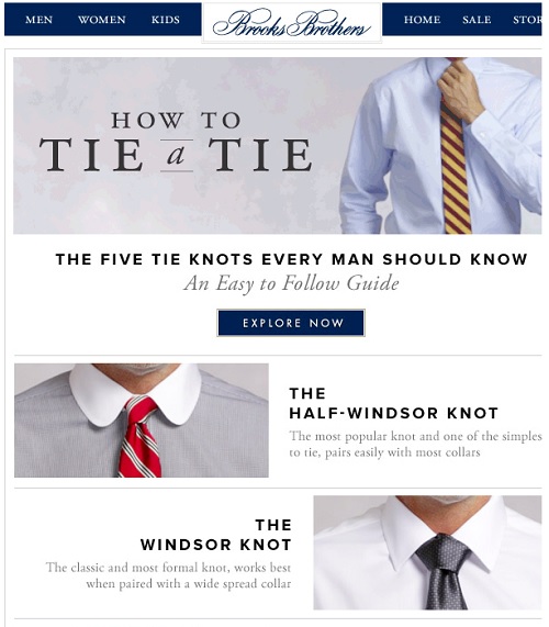
We’re fans of content that not only engages subscribers, but provides them with something usable. This Brooks Brothers email is a reminder not every email needs to highlight a product or advertise a sale. Sometimes, your customers just want to read something that makes their life easier-and this email delivers.
Firstly, Brooks Brothers knows learning how to tie classic tie knots is a topic that resonates with their buyer personas. Secondly, they make their information “snackable” and easy to access. Interested in learning how to tie a half-windsor? Bow tie? Four-in-hand? Simply click on your section of interest, and you’re taken to a page with a short, easy-to-follow instructional video and links to shop their collection of bow ties. By providing subscribers with useful content, this company is inspiring consumer loyalty and strengthening its credibility.

Sole Society
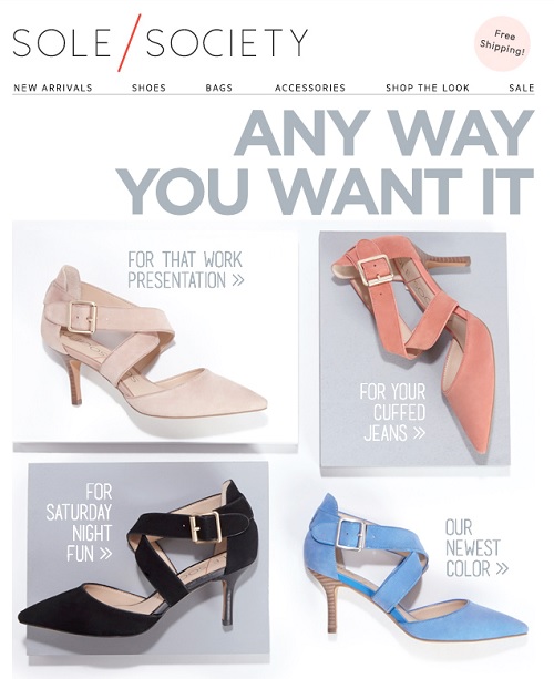
Like Brooks Brothers, Sole Society knows its buyer personas well. Here, the online membership-based eCommerce site marries useful content with promotional content. Instead of simply announcing a new product, the brand shares four styles and tips for how the shoe could be worn. Also, like Charity: Water, this company succeeds with simple, mobile-friendly design. The buttons are large, which makes them easy to view and easy to tap-even on smaller touchscreens. Lastly, we have a reminder for free shipping. Although the company always offers free ground shipping, reminding customers of this offering helps build interest and may be all the influence a subscriber needs to click and buy.
So, what do these three share-worthy emails have in common? They all use simple and attractive design, they all seamlessly guide subscribers on to the next step of the cycle and, most importantly, they’re all built to incorporate a mobile audience. Apply these practices to your own emails, and hopefully your customers will fall in love too.
Inspired to create your own email love story? Learn how to win back former customers using our Email Activity Scoring service.


 Affiliate Marketing
 Automotive
 eCommerce and Retail
 FinTech
 LeadGen
 Nonprofit and Political
 Payments
 Technology Platforms
 Tourism and Hospitality
 Heart-shaped boxes of chocolate, a dozen roses and a bottle of champagne. Sure, those things are nice, but the real way to the heart is through a great email.